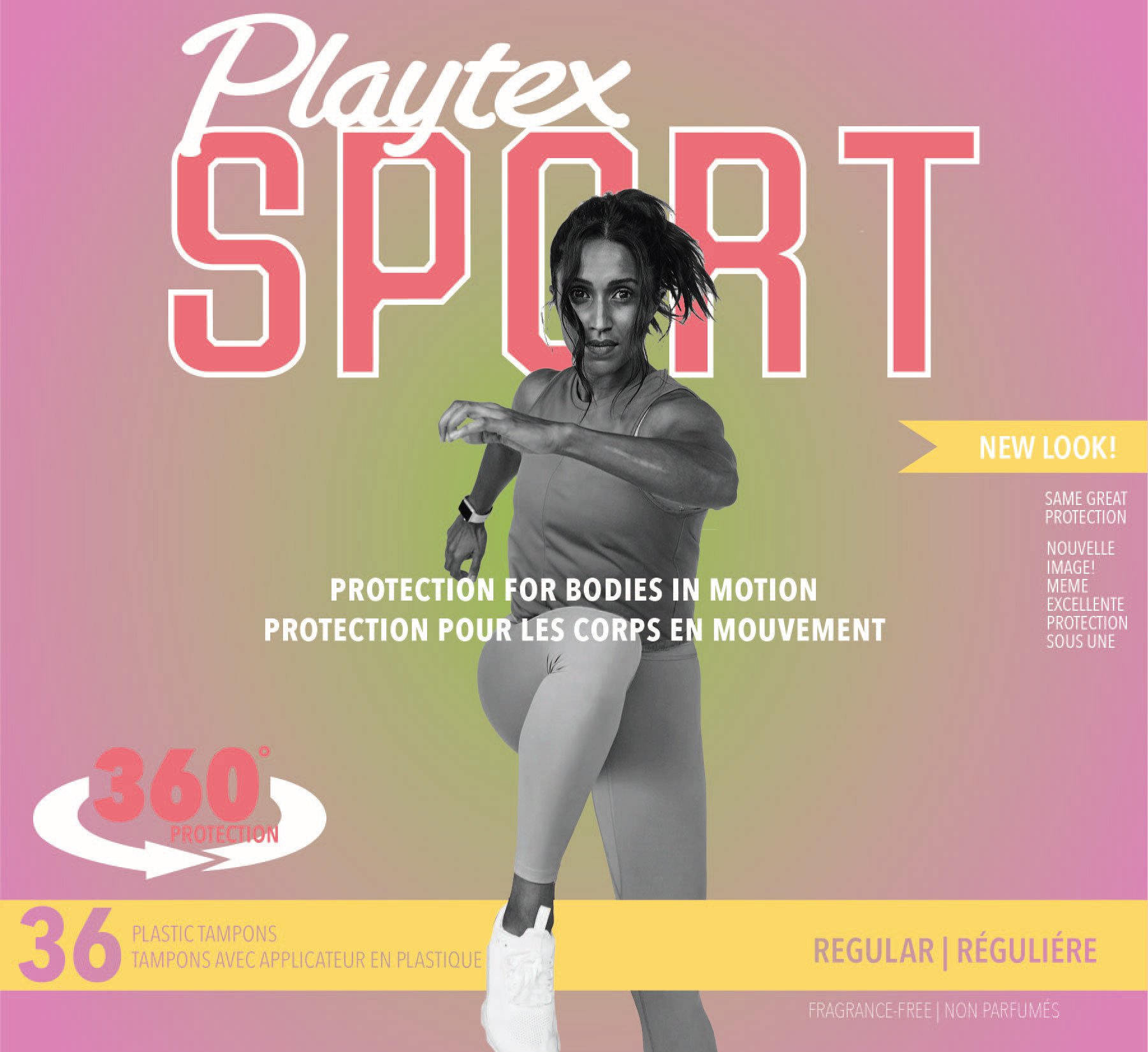
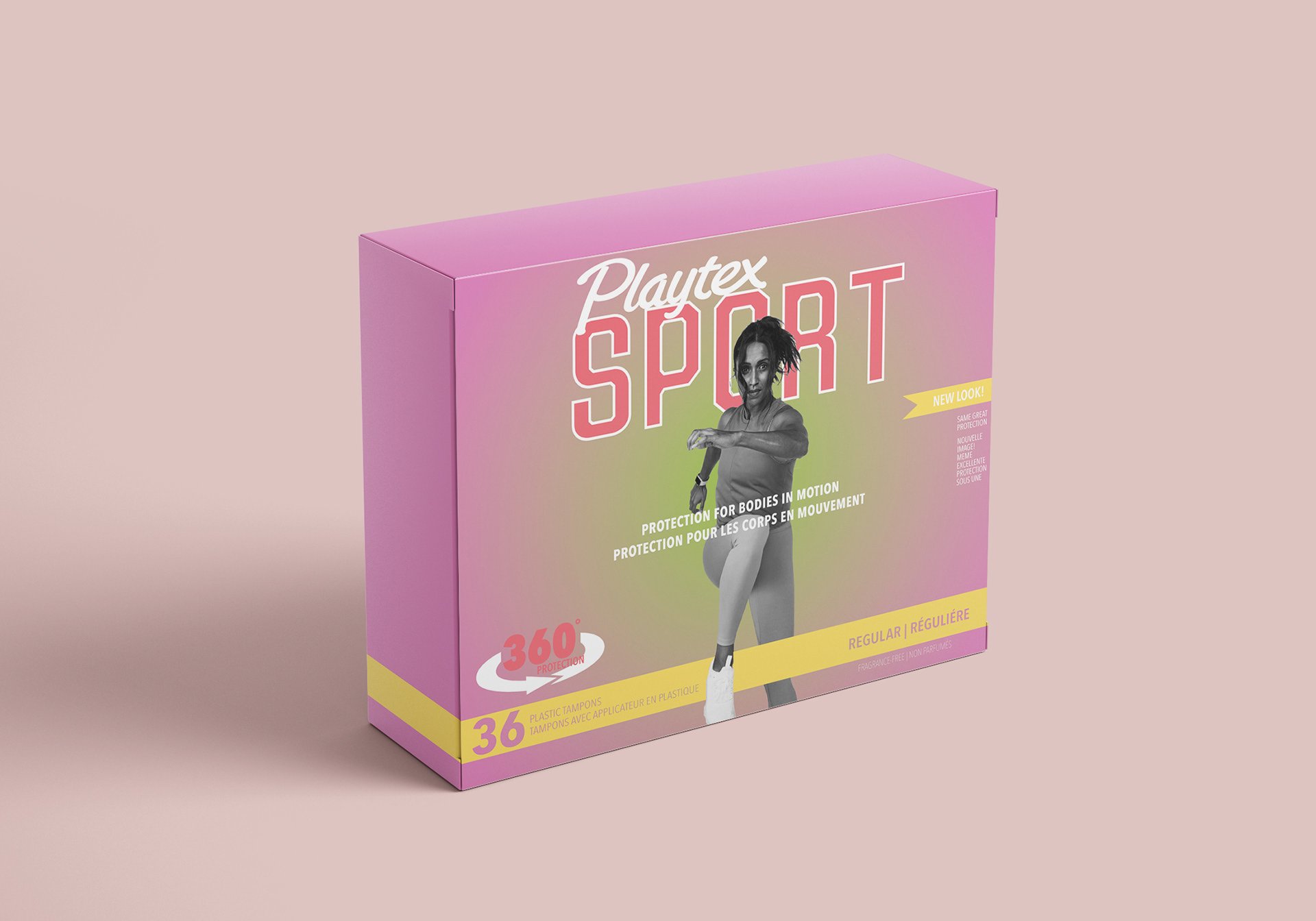
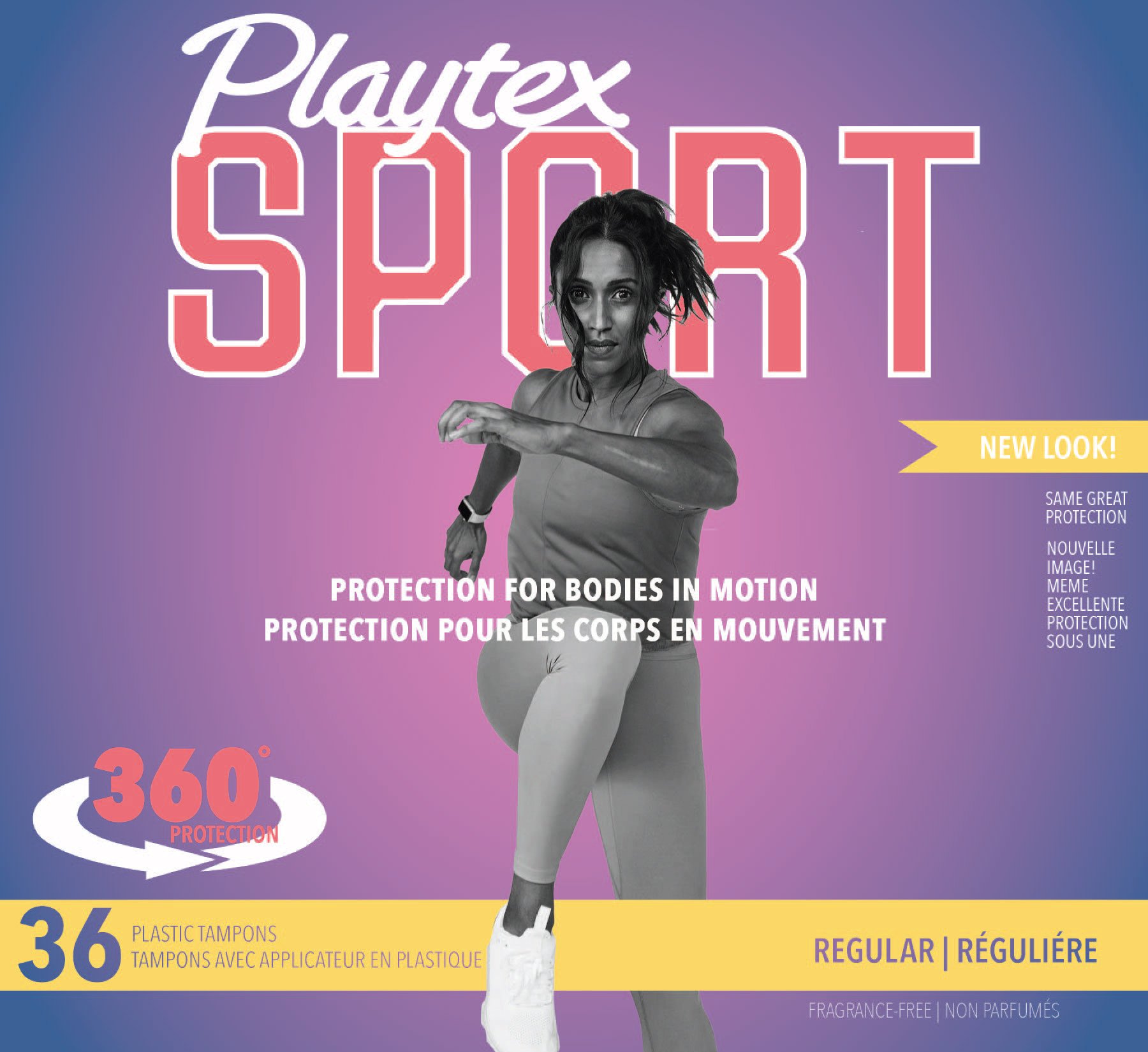
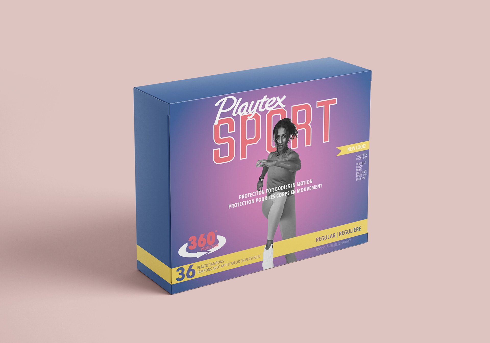
before + after
november 2020
OVERVIEW
Tasked with redesigning a mass-produced product while maintaining the brand's overall identity and integrity. By evaluating what was working versus what wasn't on the original packaging we needed to determine a plan of action to redesign the product without drastically changing its appearance for existing customers. This redesign asked us to evaluate the structure, hierarchy, colours, brand equites, and target market. The chosen product cannot be food-related and was chosen based on what was available due to the COVID-19 pandemic.
CONTRIBUTION
layout design
typography (excluding Playtex logo)